
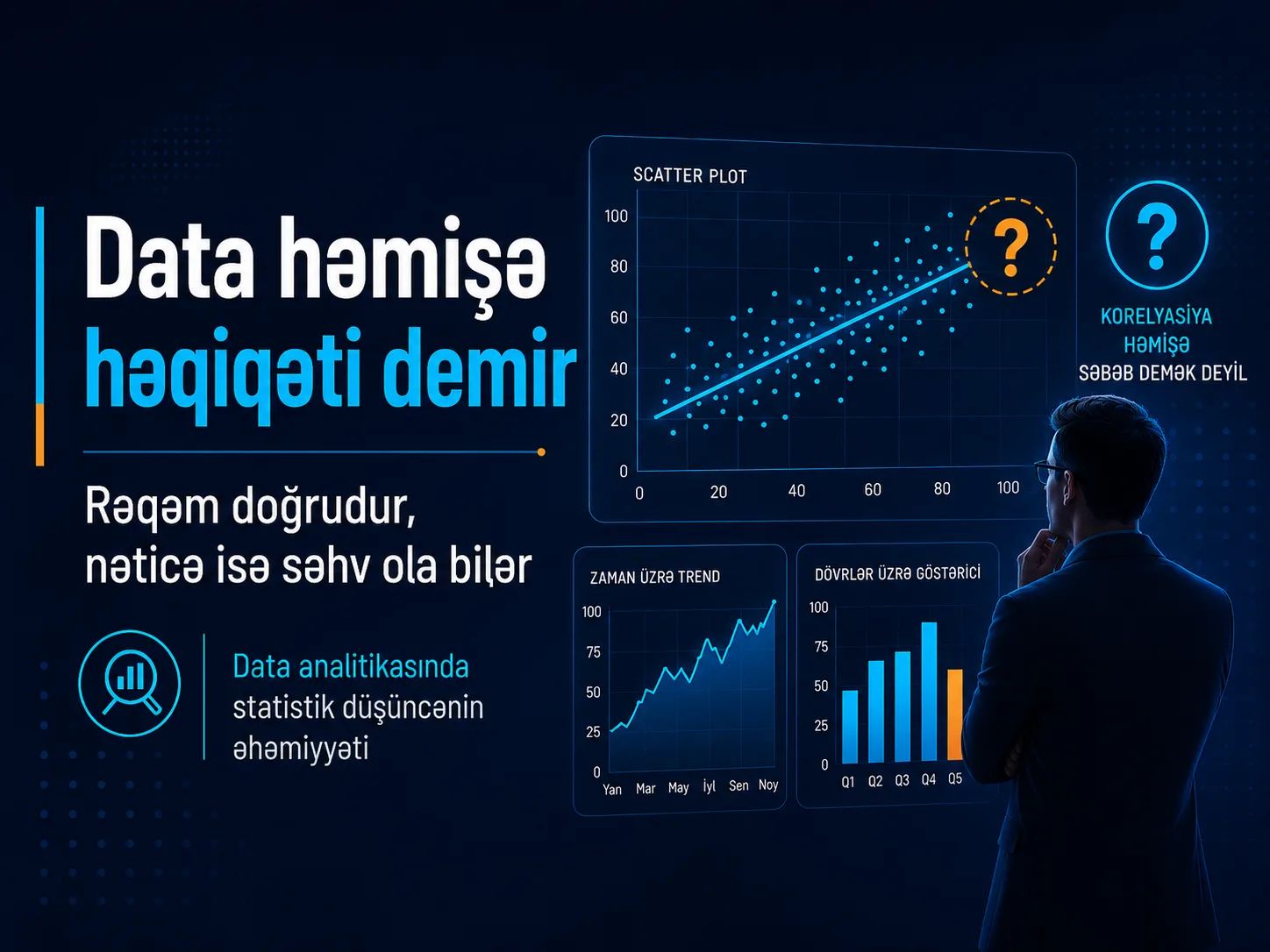
When learning data analytics, most of the attention is often focused on tools. Which functions should we know in Excel? How should we write queries in SQL? How do we build dashboards in Power BI? Or how can we analyze data using Python? Of course, each of these is an important skill for a data analyst. However, knowing the tools well is not enough to conduct reliable analysis.
One of the most important skills a data analyst can have is statistical thinking and the ability to interpret data statistically. Software can perform calculations, measure correlations, calculate averages, and create charts. But software cannot decide what those results actually mean, when they may be misleading, or how reliable they are for making decisions. That responsibility belongs to the analyst.
For example, a strong correlation between two variables does not mean that one causes the other. Similarly, a high average sales figure does not necessarily mean that every store is performing well. In some cases, a few extreme values can significantly affect the overall result. In others, the way data is collected — including who is included and who is excluded — can create a completely different picture. That is why a good data analyst should not only ask, “What is the number?” They should also ask, “Why is this number what it is?”, “Which factors may have influenced this result?” and “Would the conclusion change if we looked at the data from another perspective?”
The number can be correct while the conclusion is wrong
One of the most dangerous mistakes in data analytics is not necessarily an incorrect calculation. Sometimes the calculations are perfectly accurate, the SQL query works correctly, and the dashboard displays the right metric — yet the conclusion drawn from that metric is still wrong. The main reason is that data is not reality itself. It is only a representation of reality that has been measured, collected, and presented in a particular way. Which observations are included, which are excluded, which metrics are selected, and how the data is aggregated can all significantly influence the final interpretation. For example, a company may notice that sales have increased and immediately attribute the growth to advertising. However, during the same period, overall market demand may have increased, prices may have changed, new stores may have opened, or a seasonal sales period may have begun. In this case, the sales figure itself may be correct, but the assumed reason behind the increase may be wrong.
Statistical research also emphasizes how difficult it can be to infer direct cause-and-effect relationships from observational data. An apparent relationship may be influenced by a third variable, by the way the sample was selected, or even by reverse causality, where the direction of cause and effect is the opposite of what we initially assume. In other words, an analyst’s job does not end when the number is calculated. In many cases, that is where the real analytical work begins.
Let us look at one of the most important principles to keep in mind when performing statistical analysis:
Correlation does not imply causation
One of the most common analytical mistakes is to reason as follows:
“X increased, and Y increased at the same time. Therefore, X caused Y to increase.”
At first glance, this may sound logical. Statistically, however, the fact that two variables move together does not prove that one causes the other. Correlation simply shows that two variables are associated with each other to some degree. That relationship may genuinely be causal, but it may also be explained by other factors. Sometimes a third variable affects both variables. In other cases, what we assume to be the cause may actually be the result. This is why interpreting correlation as causation, especially when working with observational data, is one of the most common sources of analytical error.
An interesting real-world example: television ownership and life expectancy
An interesting dataset published in the Journal of Statistics Education compared indicators across 40 countries with populations of more than 20 million people.
The dataset included variables such as life expectancy, the number of people per television set, and the number of people per physician. The data referred to the year 1990.
The analysis found a correlation of −0.606 between the number of people per television and life expectancy. In other words, countries where televisions were more widely available among the population also tended to have higher average life expectancy.
If we treated this correlation as direct causation, we might reach the following conclusion:
“If we give people more televisions, they will live longer.”
Clearly, that conclusion would make little sense.
In reality, television ownership may be associated with broader socioeconomic conditions. More developed countries may have higher income levels, better access to healthcare, stronger infrastructure, higher levels of education, and better living conditions. At the same time, television ownership may also be more common in those countries. This means that other variables may be influencing both television ownership and life expectancy. In statistics, such variables are often referred to as confounding factors. Therefore, observing a relationship between television ownership and life expectancy does not mean that owning a television causes people to live longer.
How does the same mistake appear in business?
Imagine that a company has the following advertising expenditure and sales figures over four months:
Month Advertising Spend Sales
January20,000 AZN100,000 AZN
February25,000 AZN115,000 AZN
March35,000 AZN145,000 AZN
April45,000 AZN180,000 AZN
At first glance, the conclusion seems obvious:
More money was spent on advertising → sales increased.
The numbers appear to support this interpretation. As advertising expenditure increases, sales also rise.
However, a good analyst would not stop there.
Other factors may also have influenced sales during the same period. Overall market demand may have increased, product prices may have changed, new sales locations may have opened, the product range may have expanded, or the company may have entered a seasonal period of higher demand.
An entirely different explanation is also possible. The company may already have expected sales to be higher during certain months and therefore increased its advertising budget in advance.
In that case, sales did not necessarily increase because advertising increased. Instead, advertising expenditure may have increased because the company expected sales to be higher.
This is an example of why it is dangerous to establish a cause-and-effect relationship based solely on two variables moving together. Whenever an analyst identifies a correlation, the next question should be:
“What other factors could be creating this relationship?”
For example, if we want to determine whether advertising genuinely affects sales, simply calculating the correlation between advertising expenditure and revenue is not enough.
We may also need to consider seasonality, pricing, the number of stores, promotional campaigns, overall market demand, and other relevant factors. Whenever possible, A/B tests and other controlled experiments can provide stronger evidence of causality. If experimentation is not possible, analysts can compare different groups, build appropriate statistical models, and include other potentially influential variables in the analysis.
The key takeaway is simple:
Correlation tells us that two variables are moving together. It does not tell us why that relationship exists.
Finding the answer to that “why?” is one of the most important responsibilities of a data analyst.
Conclusion
Statistical knowledge and statistical thinking are essential for anyone who wants to succeed in data analytics. Learning tools such as Excel, SQL, Power BI, and Python is important, but those tools mainly help us process and visualize data.
The real value of an analyst lies in the ability to question results, recognize misleading patterns, consider alternative explanations, and turn numbers into reliable conclusions.
Without a solid understanding of statistics and statistical analysis, it is possible to calculate the right numbers and still make the wrong decisions.


-1791896541979.webp&w=1920&q=64)
-1791287036286.webp&w=1920&q=64)
-1790689956071.webp&w=1920&q=64)
-1790063117439.webp&w=1920&q=64)
-1789462116668.webp&w=1920&q=64)